HMI Touchscreen Interface
Review of the old Design
The old HMI design had its strengths but struggled with clarity and usability in some areas. The interface felt cluttered, making it harder for users to quickly locate essential controls. Important information blended with less critical elements, forcing users to scan longer than necessary. Buttons and interactive elements lacked consistency, sometimes feeling too small or placed too close together, which could lead to accidental touches. Navigation was another weak point—some features were buried too deep, requiring too many taps to access frequently used functions. Additionally, feedback and status indicators weren’t always distinct enough, making it difficult to immediately assess warnings or errors.


New suggestions
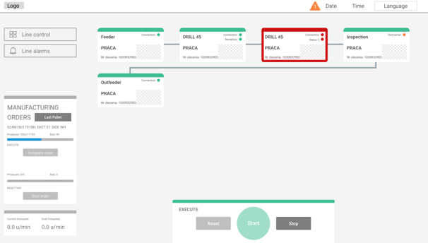
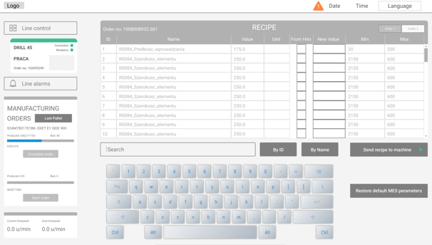
The new design focuses on simplicity and efficiency. Key functions are now front and center, reducing unnecessary visual noise and making the interface easier to navigate. Buttons are larger, well-spaced, and uniform, ensuring a smoother experience on touchscreens. Status indicators use clear color coding, instantly showing system health—green for normal, yellow for warnings, and red for critical issues. Navigation has been streamlined, so users can access essential controls faster without unnecessary steps. The overall layout feels more structured, improving both speed and usability. With these refinements, the interface becomes more intuitive, reducing cognitive load and improving workflow efficiency.
